Step 1
Load the example pipeline.
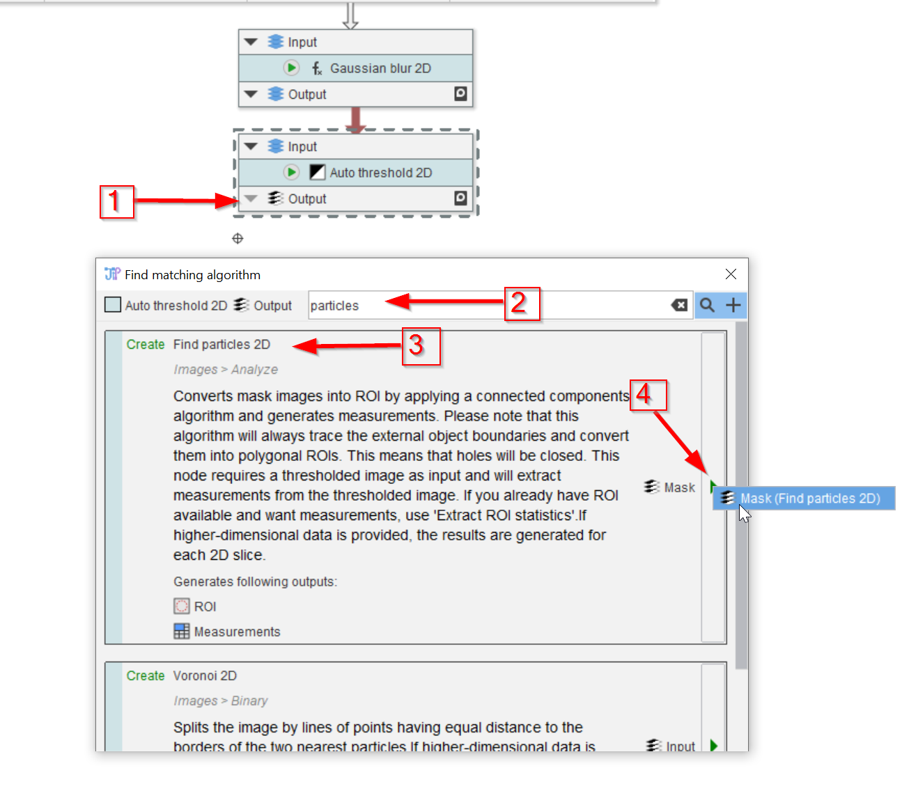
In the Processing compartment, disconnect the output node from the Auto threshold 2D node (red arrow 1).
Locate the particle finder node by searching with keywords (red arrow 2, e.g., in the Find matching algorithm window. Chose the Find particles 2D node (red arrow 3) and add it to the pipeline (red arrow 4).
Step 2
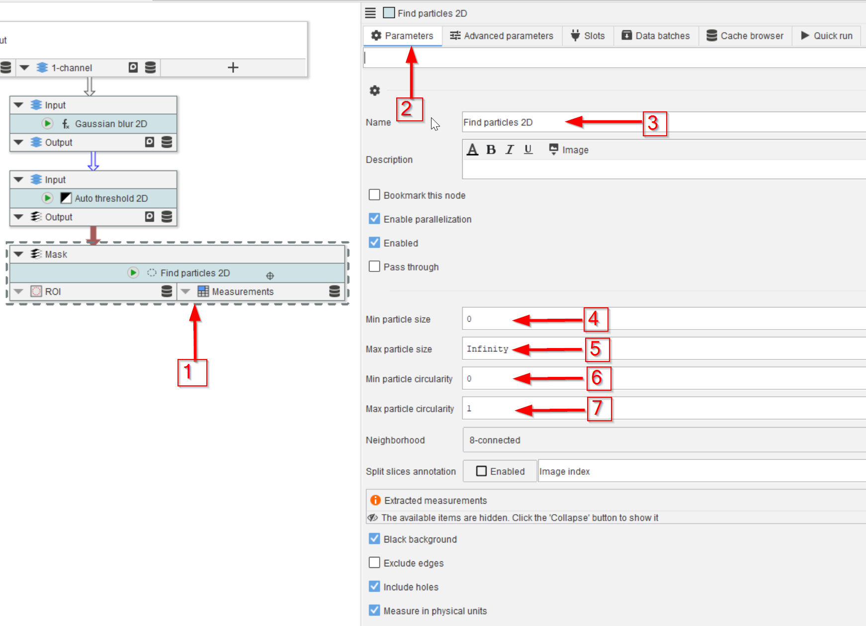
Select the Find particles 2D node (red arrow 1) and examine the Parameters tab (red arrow 2).
In addition to the name parameter (red arrow 3), the minimum and maximum values of the size and circularity (red arrows 4 to 7) can be controlled here, similarly to how it works in ImageJ.
Step 3
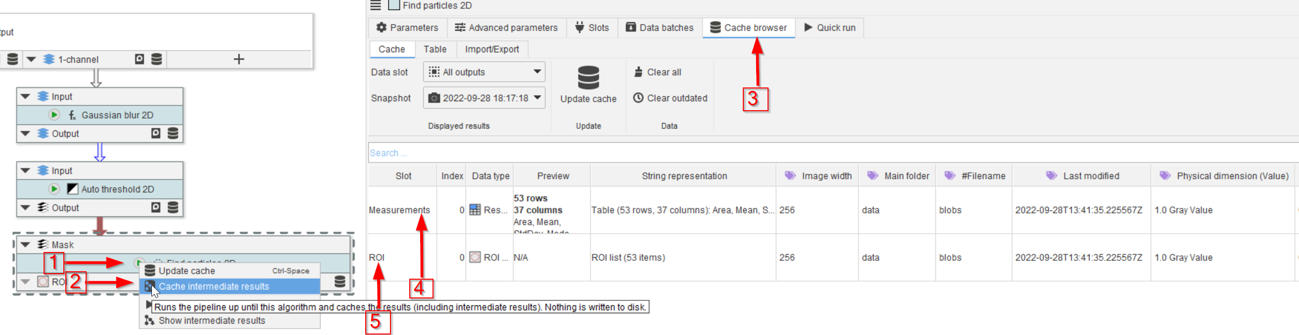
Run the Find particles 2D node (red arrow 1), preferable with Cache intermediate results (red arrow 2). Examine the cache via the Cache browser (red arrow 3).
The identified regions of interest are measured (red arrow 4) and the ROIs are also saved (red arrow 5).
Step 4
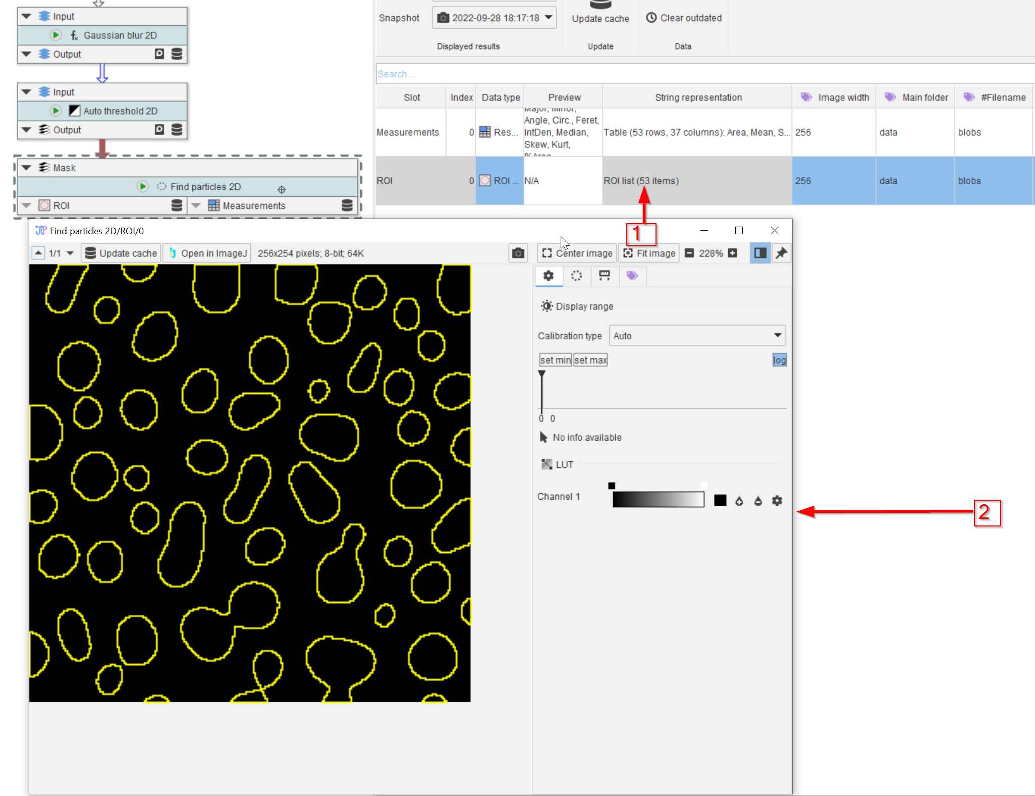
Here 53 ROIs were found (column String representation, red arrow 1), and they can be directly observed by double-clicking the cache item (red arrow 2).
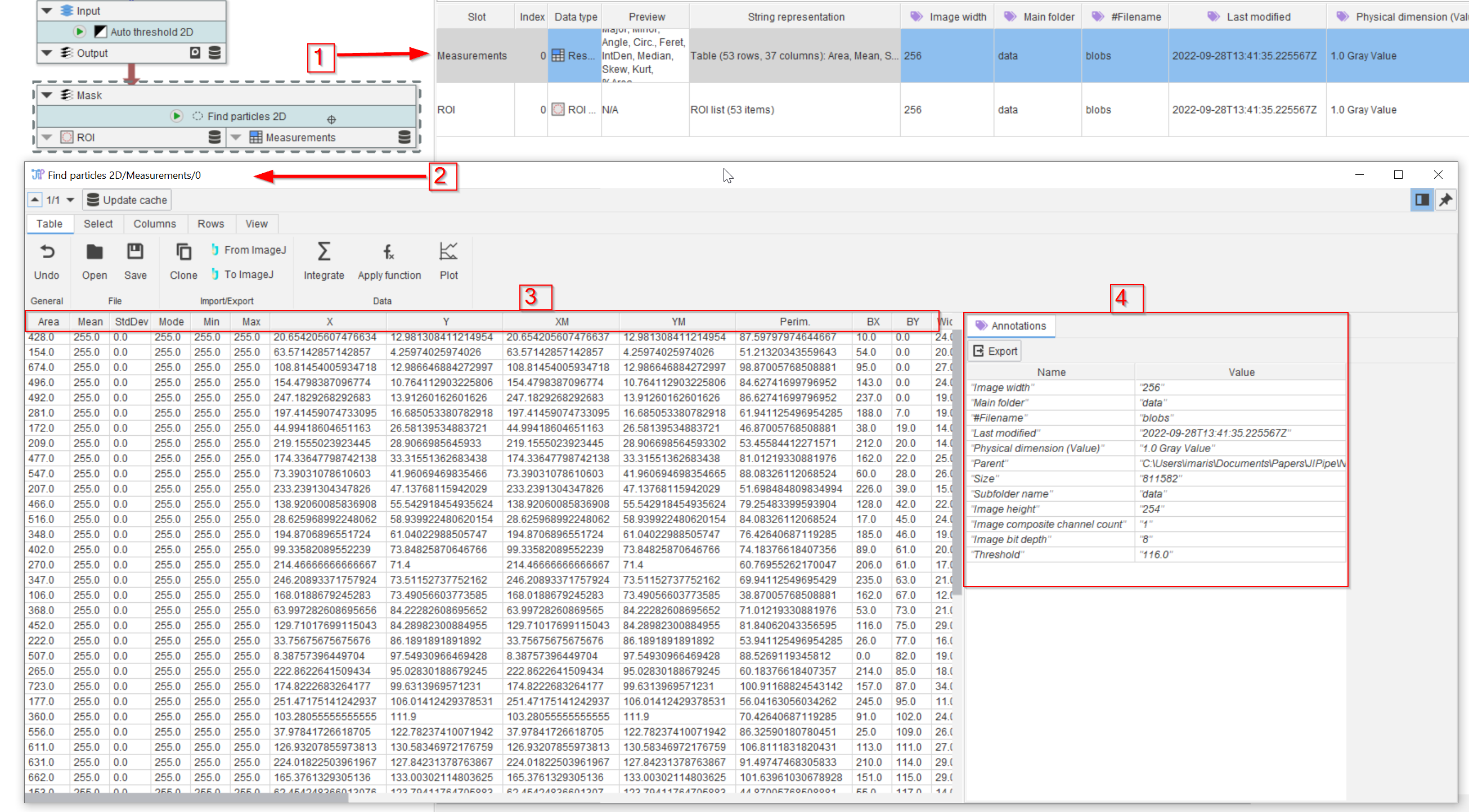
Step 5
Similarly, the Measurement table (red arrow 1) can be opened in a new window (red arrow 2) by double-clicking. The measured parameters are the same as provided in ImageJ (red rectangle 3), and we can also observe the annotations (red rectangle 4).
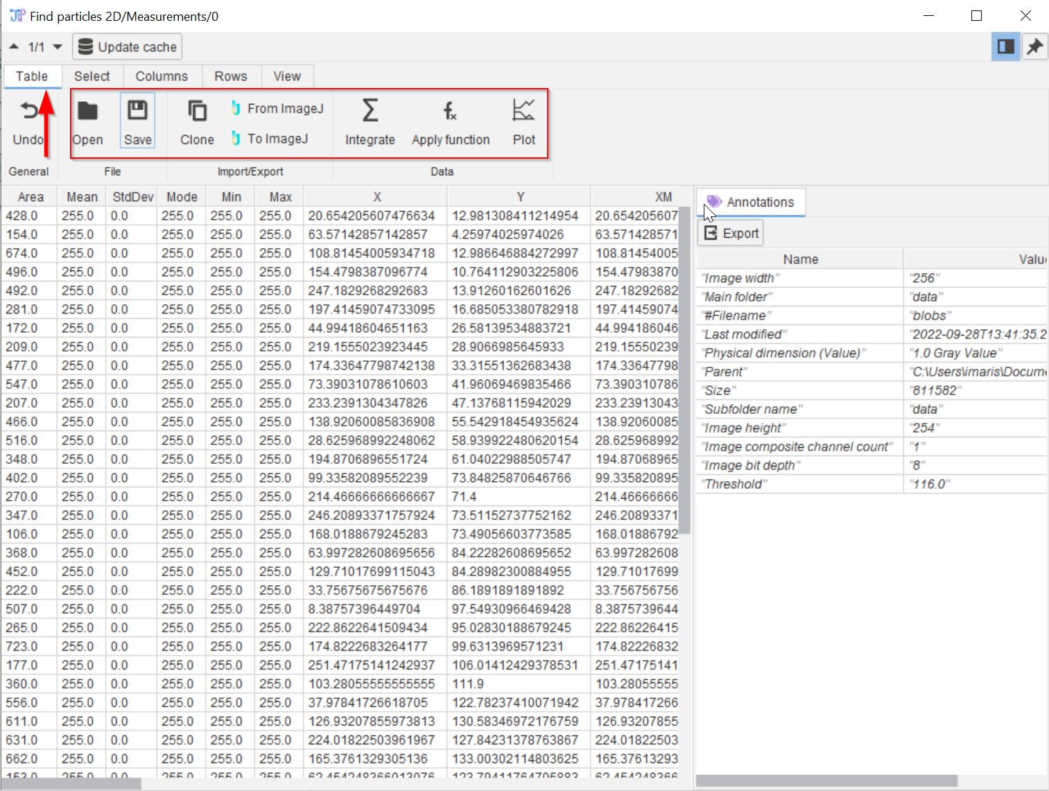
Step 6
The table viewer (red arrow 1) provides additional functionalities (red rectangle), including saving the table as CSV or XLSX, applying a selection of functions, sending data to and from ImageJ results, etc.

Step 7
In the table viewer (red arrow 1) it is also possible to plot column content. Click on the Plot button (red arrow 2) and choose e.g., the Histogram option (red arrow 3) .

Step 8
Go to the Series tab (red arrow 1) to select the source data. The name of the data series can be set (red arrow 2). Select e.g., the Area column (red arrow 3).
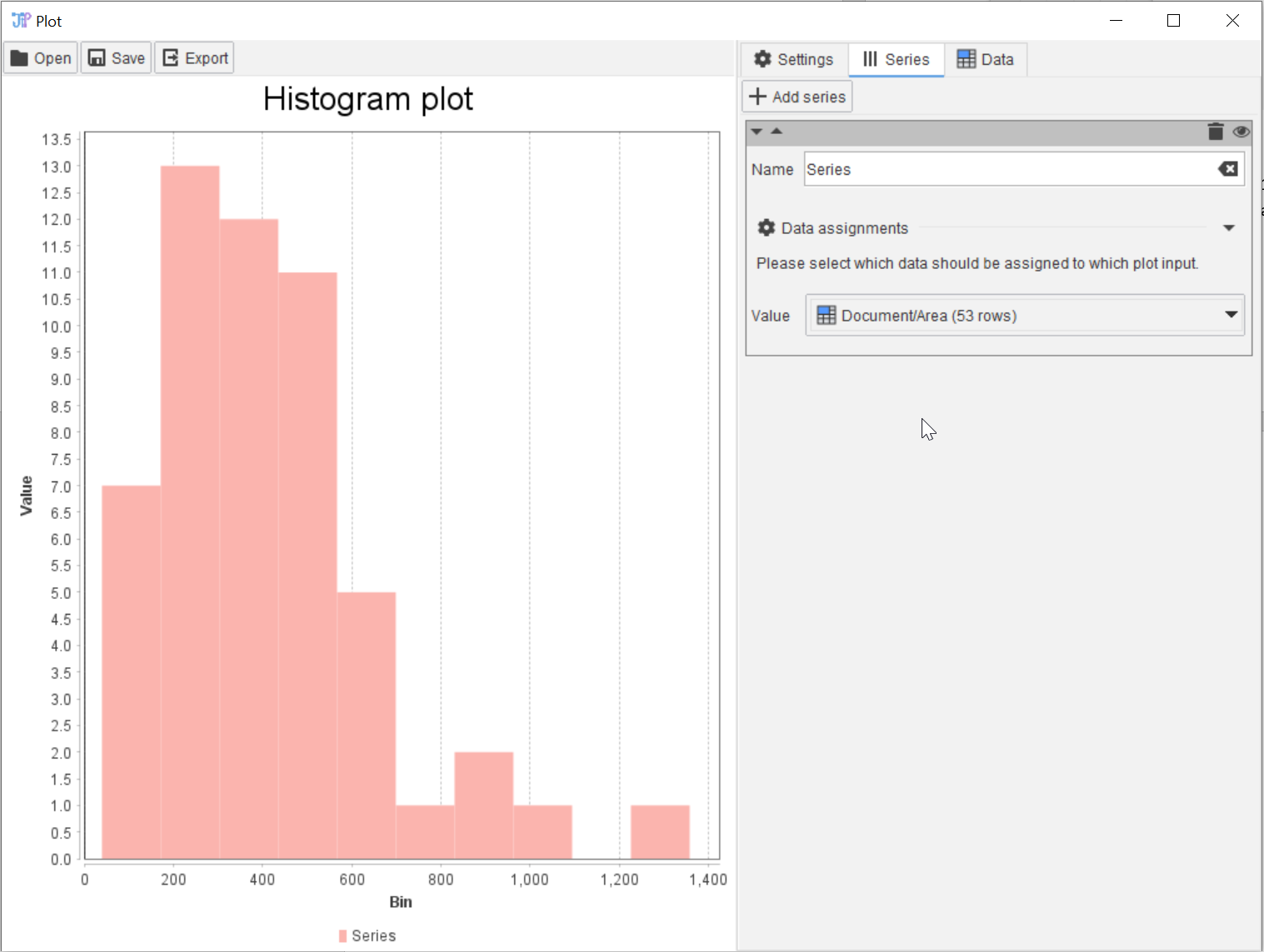
Step 9
The resulting histogram will appear, according to the default settings of its appearance.
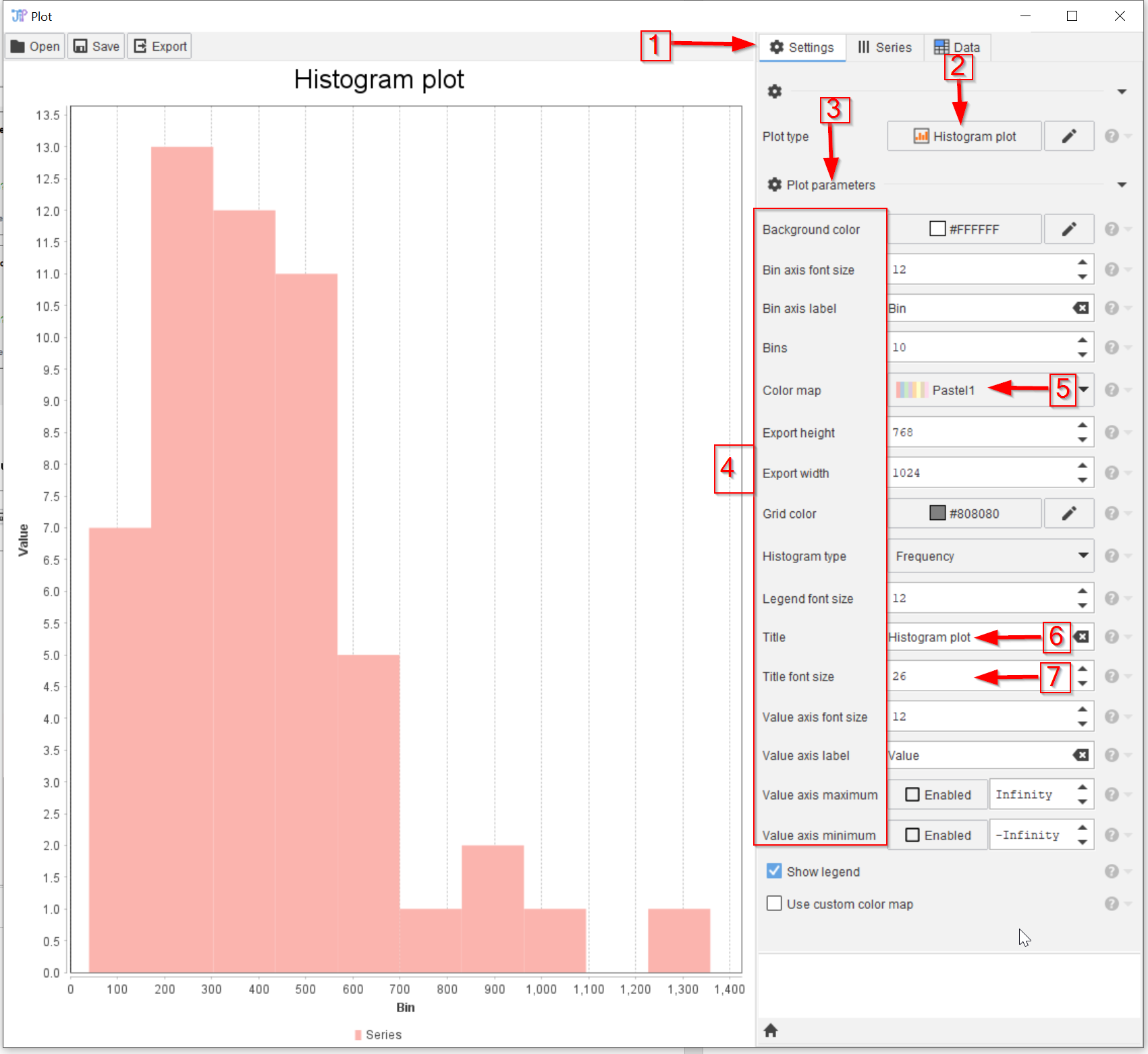
Step 10
To change the appearance of plots, go to the Settings tab (red arrow 1), where the plot type can be changed (red arrow 2), together with many parameters (red arrow 3) as shown in the red rectangle 4.
These include, e.g., color schemes (red arrow 5), titles and labels (red arrow 6), font sizes and typefaces (red arrow 7), etc.
Experiment with these parameters!
Step 11
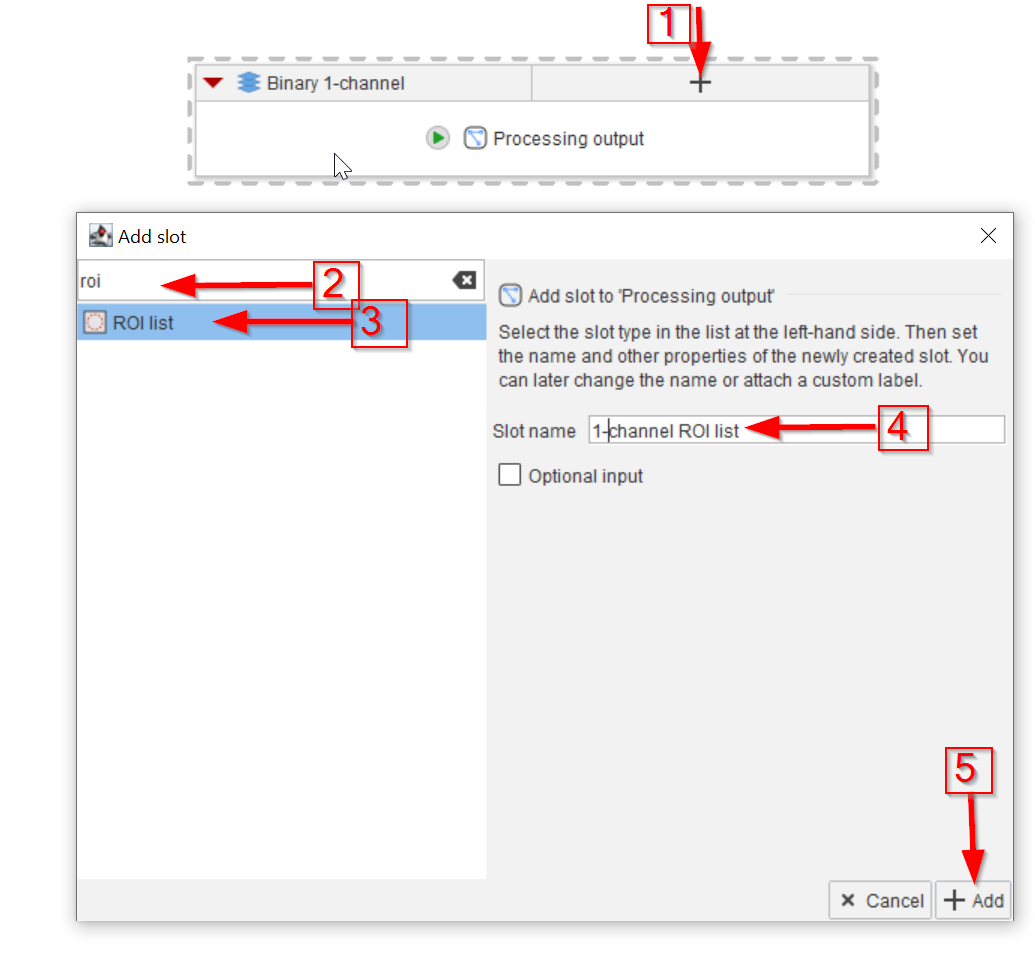
It is always good practice to output the final results of a compartment into the compartment output.
Add a new input slot to the compartment output node for the ROI list (red arrow 1) by searching for roi (red arrow 2) and selecting the ROI list data type (red arrow 3).
Name the new slot (red arrow 4) and add it to the node (red arrow 5).

Step 12
Add another input slot for Measurements (use the search word “results” to find the Results table data type) (red arrow 1).
Connect all three slots to the corresponding output slots (red arrows 2 to 4).
This completes this workflow.