Image analysis pipeline
This tutorial is also available as video.
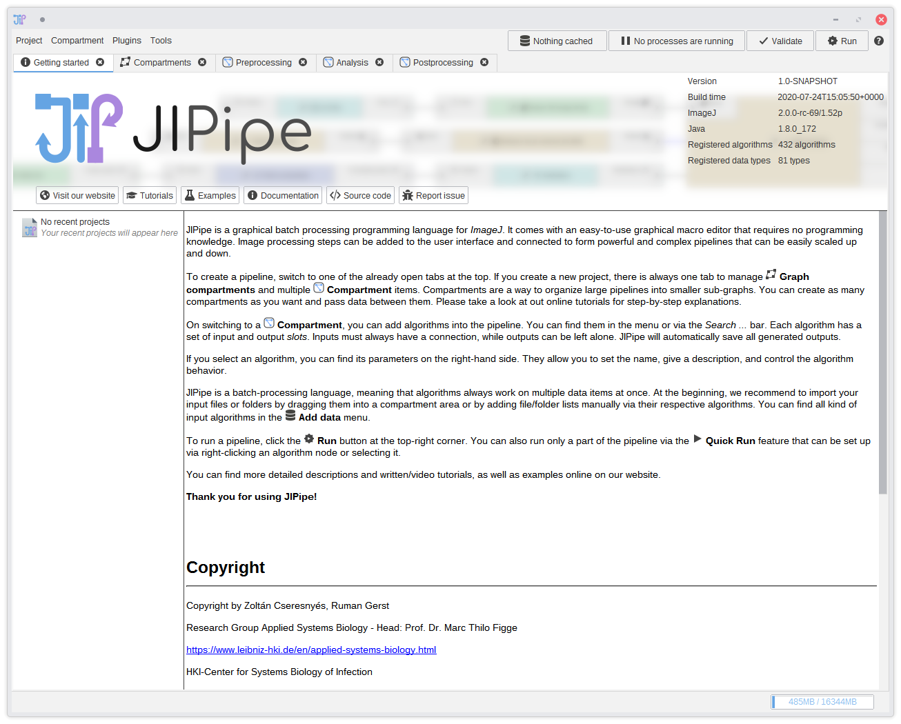
1. First start
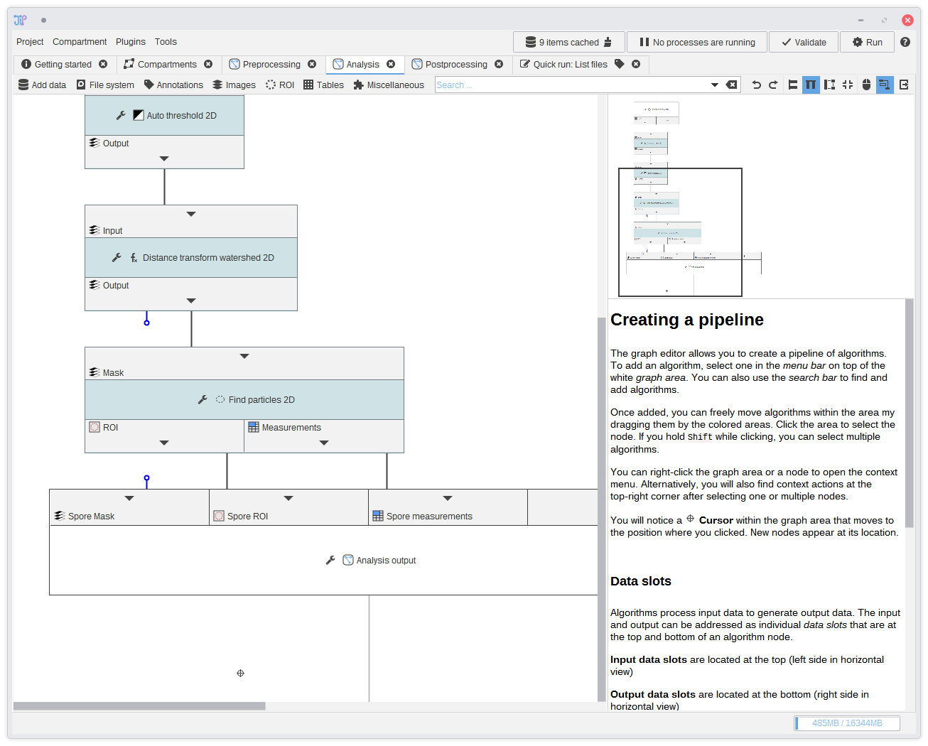
On starting JIPipe, you will see such a screen: It contains a short introduction, the graph compartment editor, an three pre-defined graph compartments Preprocessing, Analysis, and Postprocessing. As described in the graph compartment documentation, you can ignore graph graph compartments. But in this tutorial we will make use of its capabilities to clearly separate the pipeline into the mentioned tree steps.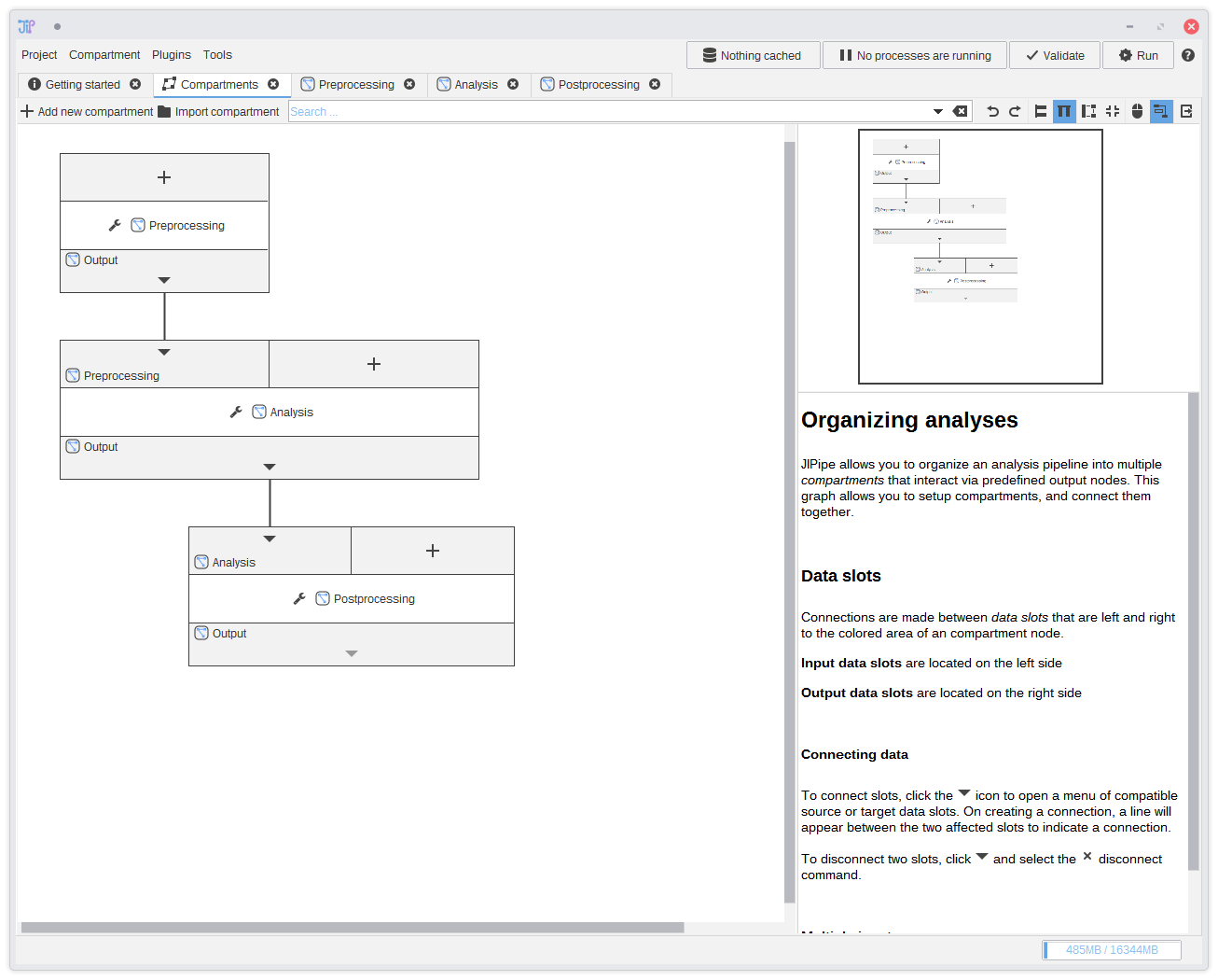
2. Graph compartments
Here you can see how the data flows between graph compartments. You do not have to do anything here, as this is the default configuration. Data flows from Preprocessing to Analysis, and finally to Postprocessing.You can ignore the graph compartments and of course define your own data flow. Graph compartments are very flexible. Just take a look at the documentation.
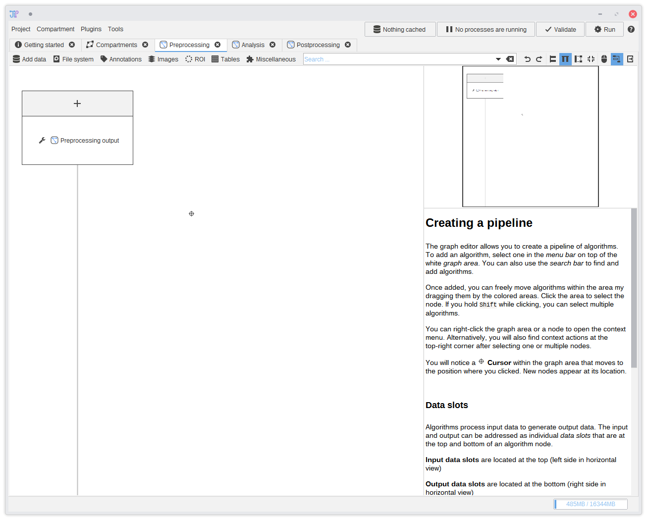
3. Preprocessing
In this tutorial, the preprocessing step should consist of algorithms that load and organize data for the following processes. To switch to the graph editor for the preprocessing step, just click thePreprocessing tab.
You will find an empty graph aside of the
Preprocessing output node. We will utilize this node in
a later step to pass preprocessed data to other steps.
The graph is stored project-wide. You can just close all graph editors that you do not need for the current task.
You can re-open them via the graph compartment editor. If you closed it, you can re-open it via the Compartment menu in the project menu bar.
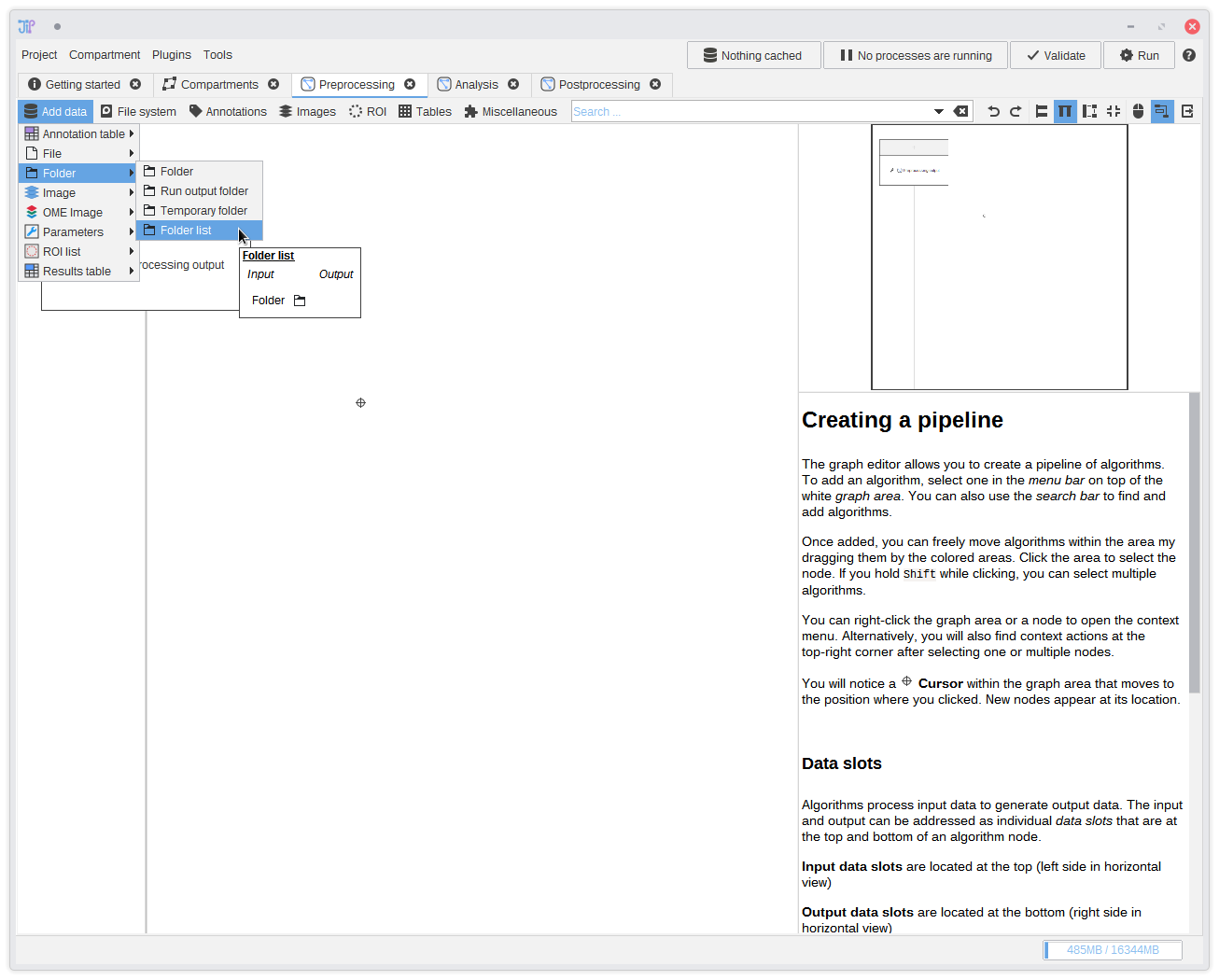
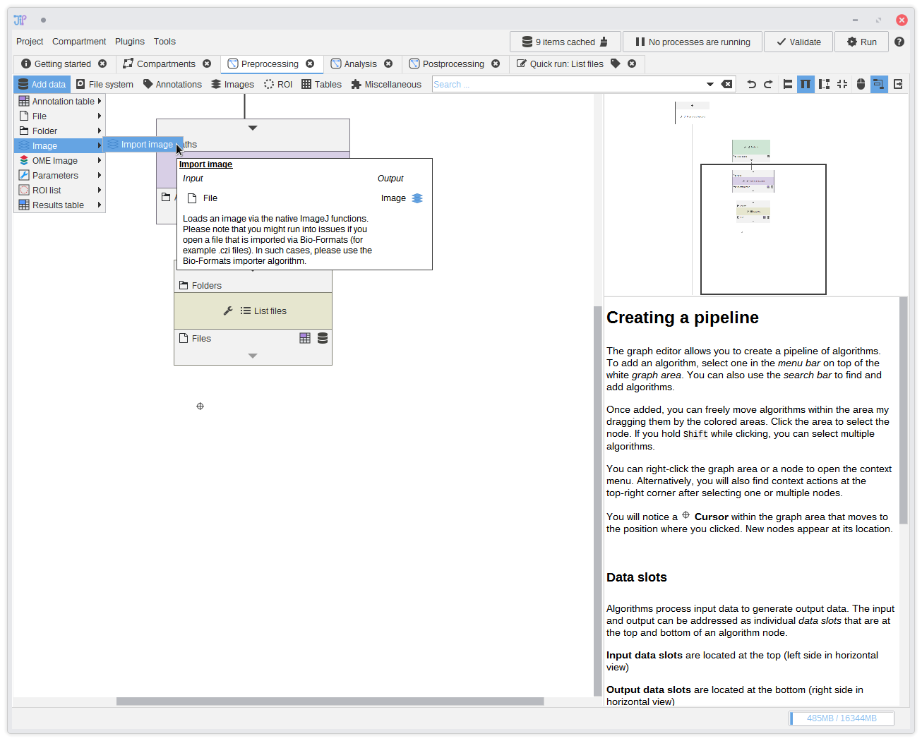
4. Adding a data source
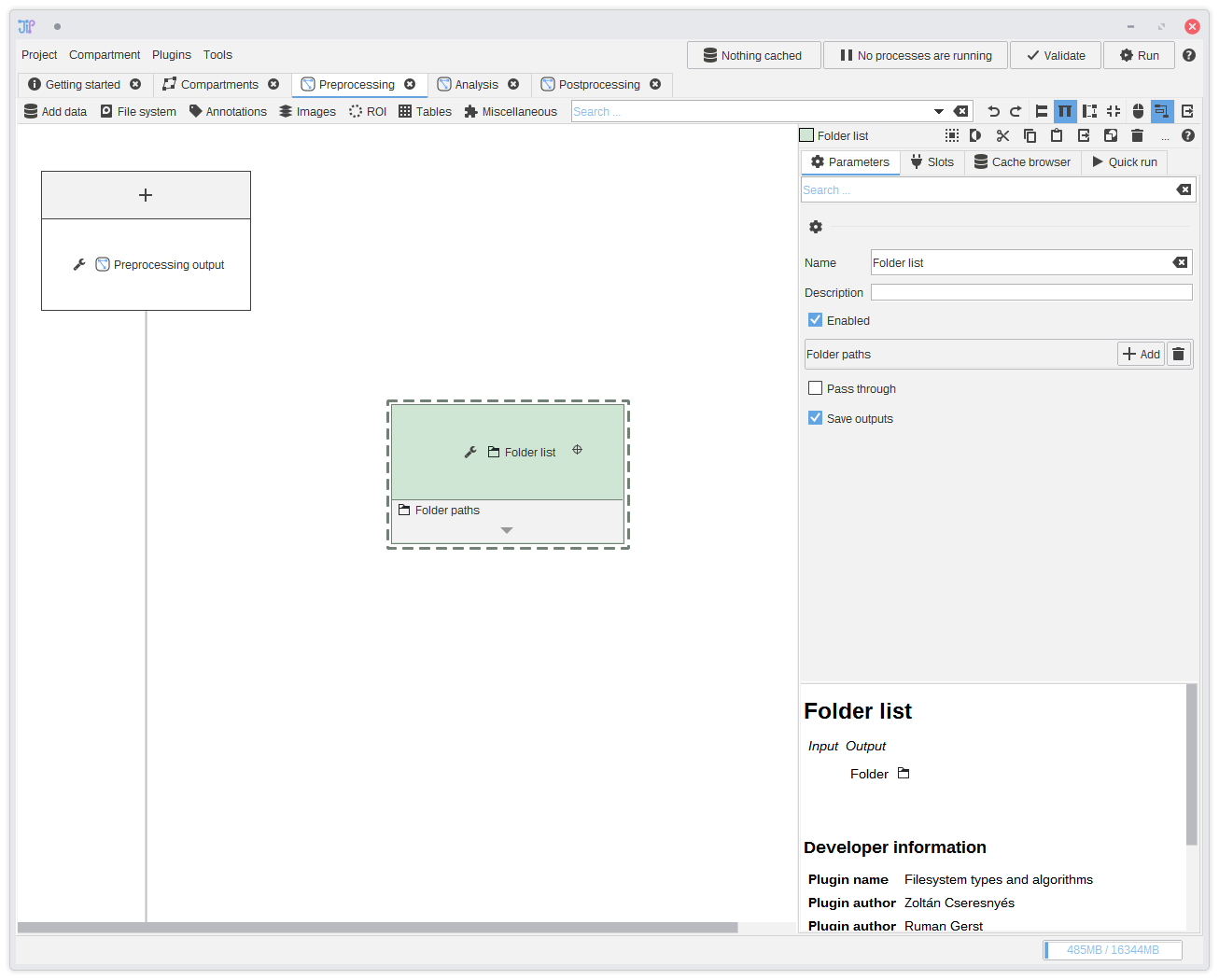
The most common way how data is provided is to load them from files or folders. JIPipe comes preinstalled with data-types and algorithms that handle filesystem operations. The tutorial data is supplied as set of folders that contain the input images as TIFF files in a sub-directory.We begin by adding a data source that supplies a list of folders. You can find it in
Add data > Folder > Folder list. After selecting the item, it will appear in the graph.
You can also drag folders and/or files directly into the graph editor area. Corresponding file data source nodes are then created. For this example, you could just drag the input data folders directly into the graph.
You do not have to navigate via the menu. You can also type the algorithm name or some keywords into the bar that reads Search ....
5. Including the input folders
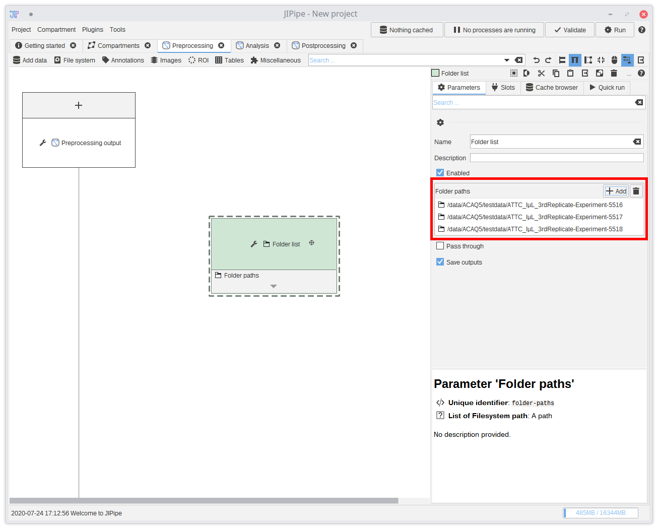
Select the newly created algorithm node by clicking it. The panel on the right-hand side will update and allow you to change the parameters of the selected algorithm node. Click the Add button and select the input folders.You can save the current project at any time and re-load it later. If you save it in a parent directory relative to where your data is located, JIPipe automatically saves all paths relative to the project file. This means you can just move all your data, including the project to other machines or hard drive partitions without breaking anything.
6. Annotating data
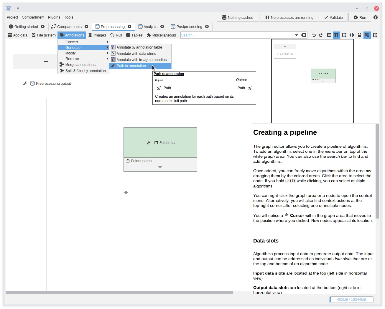
JIPipe is designed as batch processing tool, meaning that it can be always scaled from small test data up to large data sets. It can be helpful for you and some algorithms to know which data belongs together. JIPipe introduces the concept of data annotations that assign data to an unique data set and are passed through the pipeline. You can find more about this in the documentation about how JIPipe processes data.In this step we add the data annotation directly at the beginning by attaching the input folder name to each folder that was passed into the pipeline. This is done via the
Annotations > Generate > Path to annotation algorithm. Just add this algorithm into the graph.For more advanced projects there are plenty of other sources for annotations, like importing them from tables, or extracting and modifying annotations.
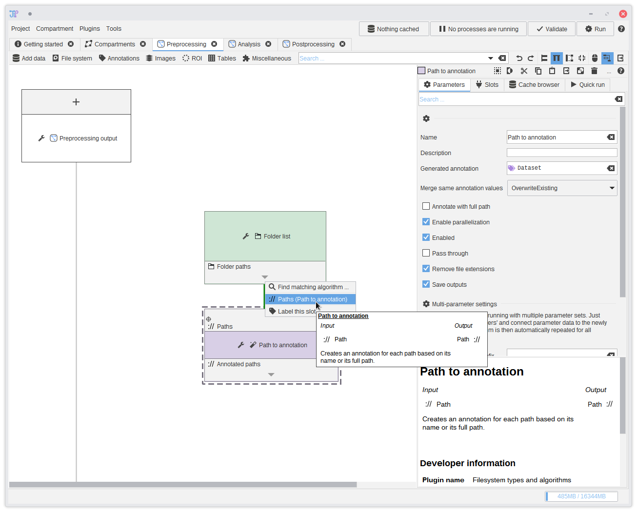
7. Connecting slots
The input folders are converted into a format understandable by JIPipe by theFolder list algorithm. The output then can be passed to following algorithms
like the Folders to annotations algorithm we added in the last step.To make a connection click the or button and select the available data slot. You can see that a connection between the two data slots was created.
This list is always sorted from the closest to the farthest away slot.
You can also use your mouse to drag a connection between slots.
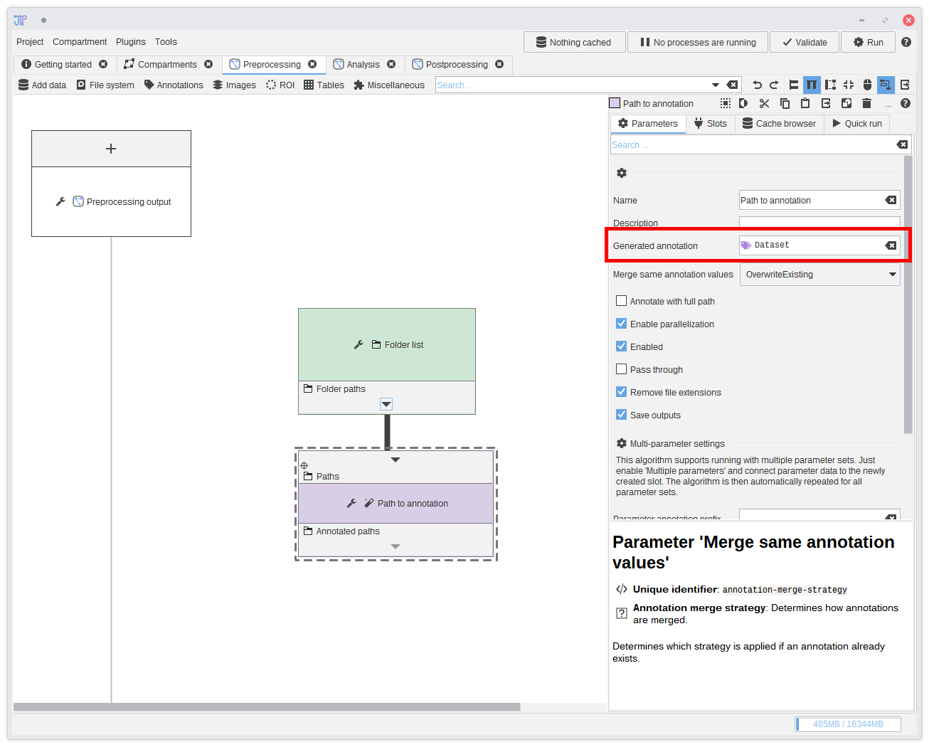
8. Annotation type
Annotations are like columns in a table - only that our table contains complex data types. The Path to annotation algorithm automatically extracts the path's file name (or directory name) and annotates it to the input row. By default, the algorithm creates a columnDataset. If you want you can
change it to another meaningful column name. And with more complex projects you will probably have many different columns.
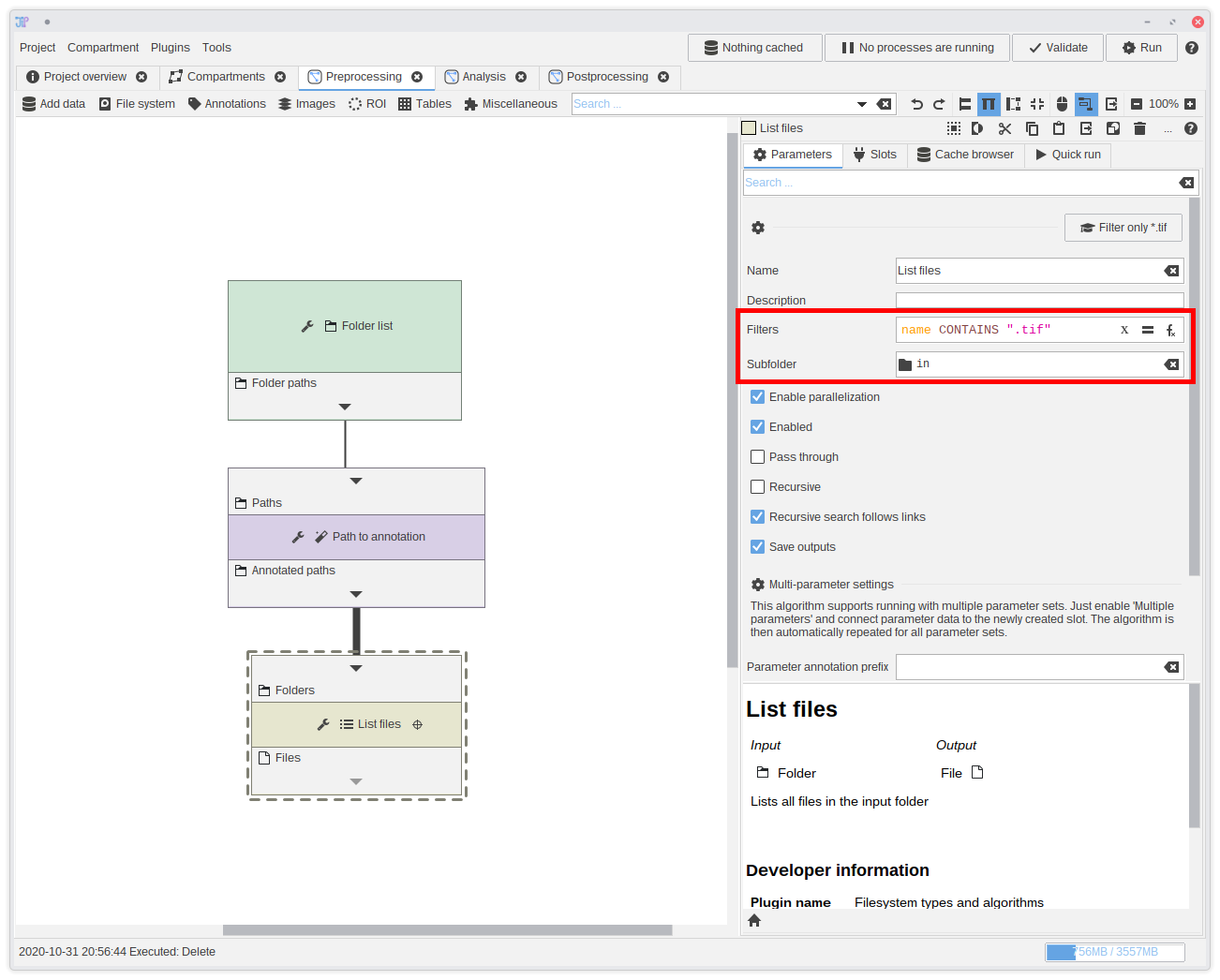
9. Extracting the image file
We have now the folders and can extract the input image file from each one of them.You can find an algorithm designed for such purposed in
File system > List > List files. Add it to the graph and connect it to the Subfolder name output.
This algorithm is not only able to list files, but also filter them directly.In this case, we exactly know that our files are located within a sub-folder
in. Please update the Subfolder parameter by setting it to in.
The filter uses an expression that allows highly flexible filters. But for this example, we only want to test if the filename contains .tif.
To do this, type name CONTAINS ".tif" into the filter box.
If you have more complicate folder structures, you can apply the "Navigate to sub-folder" operation with a distinct algorithm. You can find it in the Filesytem category.
We highly recommend that you get familiar with expressions, as they are present in most filtering or generation nodes. They are easy to learn and write, but also allow extremely powerful operations.
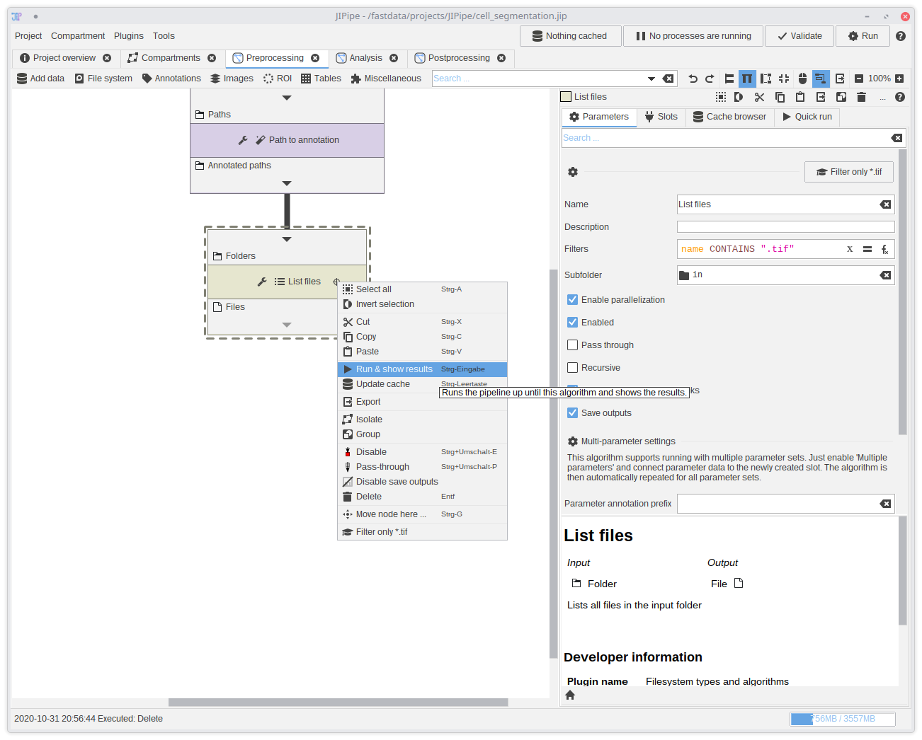
10. Testing if the pipeline is correct (Optional)
The Quick Run feature allows you to run the pipeline until the selected algorithm and compare multiple parameter sets. It is a good way to test if the pipeline works so far. To create a quick run right-click theList files node and select Run & show results.
The quick run will check if the pipeline is valid might show some error. If you think that the pipeline is valid, click Retry to check the pipeline again. It sometimes does not update for performance reasons.
You can also do a quick-run that just refreshes the Cache.
You can also start a Quick Run from the parameter panel if you select the algorithm.
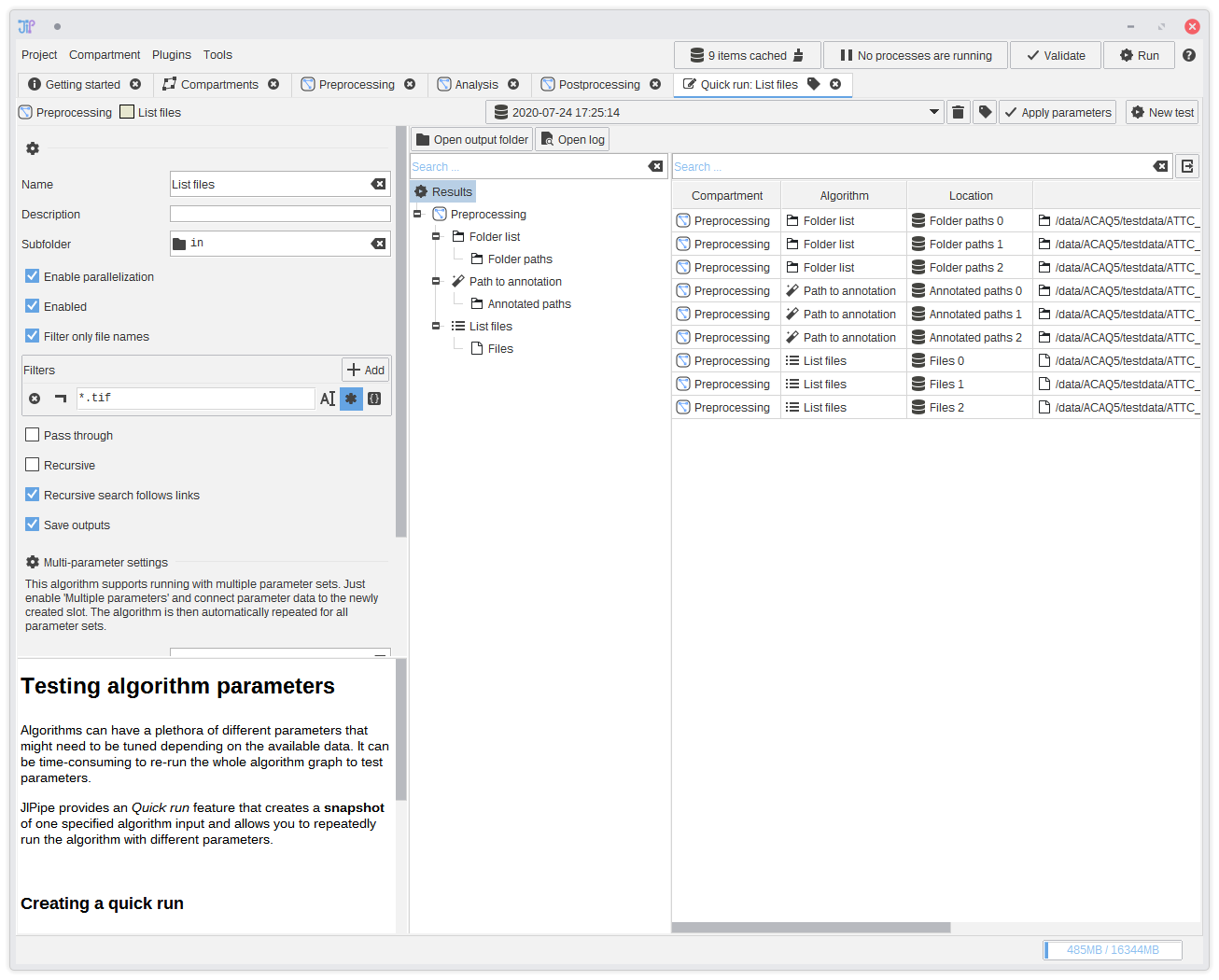
11. Testing if the pipeline is correct - results (Optional)
Navigate to the output if theList files algorithm and check if the file paths are correct.
See our Quick Run documentation for more information about the testbench and its features.
12. Importing the images
After correctly setting up the files, you can import them as images. You can find various importers for image types inAdd data.
Our images do not require Bio-Formats, so we choose Add data > Image >Import image. Connect it to the output of List files.
The Import image node does not ensure the exact bit depth and dimensionality of the output image. You can change this via a parameter that allows you
to choose the exact image type.
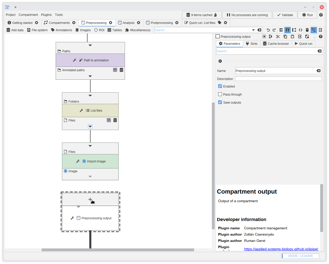
13. Preprocessing output
You could continue with the analysis directly from theImport image node. But to showcase the graph compartments feature, we decide to
have the imported greyscale image as output for of the Preprocessing compartment. The output of a graph compartment is only interfaced through a special node,
in this case Preprocessing output.We first have to define an output slot by clicking the button. Select
Import image,
set a name, and click Add.
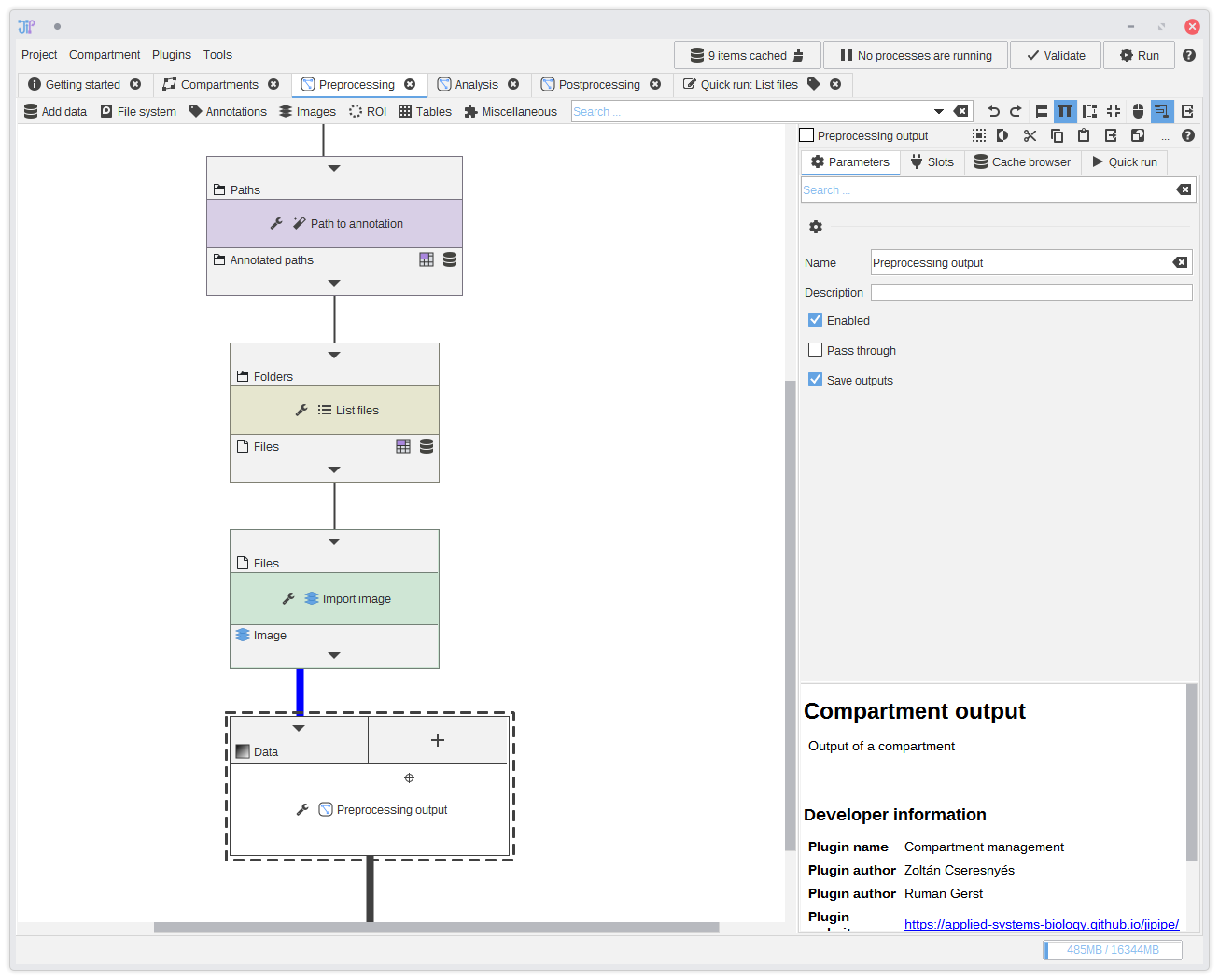
14. Connecting the output
Finally, connect the output ofImport image to the new input slot of Preprocessing output.
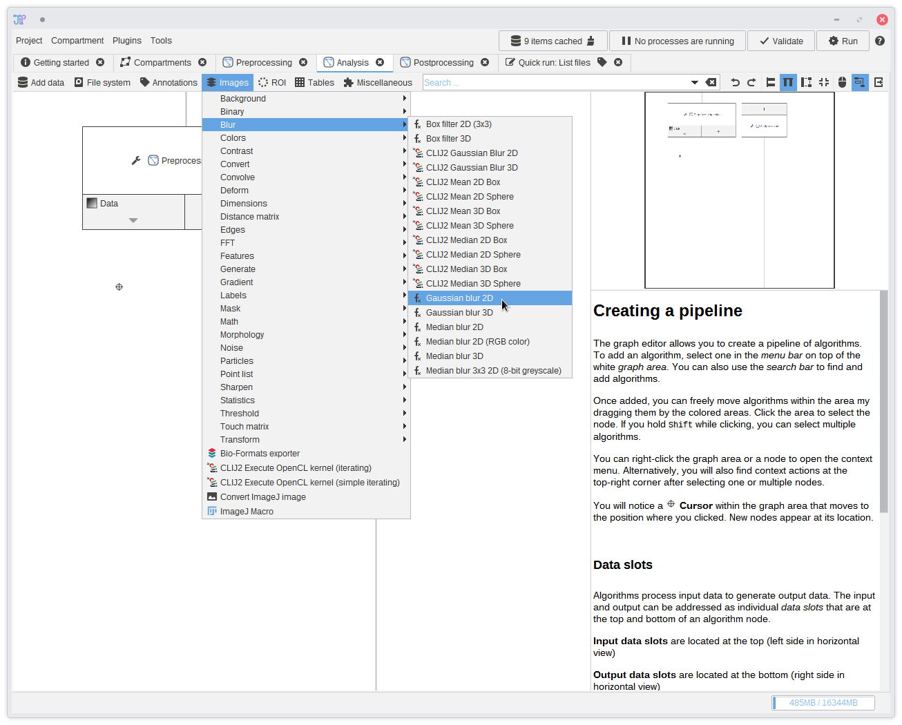
15. The analysis
Now we are finished with the preprocessing. Switch to theAnalysis graph compartment by selecting the tab in the tab bar.
You see that it also contains a node called Preprocessing output. This is the same node as in the preprocessing compartment, but
it only contains output data this time.We continue the analysis with a Gaussian filter that can be found in
Images > Blur > Gaussian blur 2D.
Add it to the graph and connect it to the output of Preprocessing output.
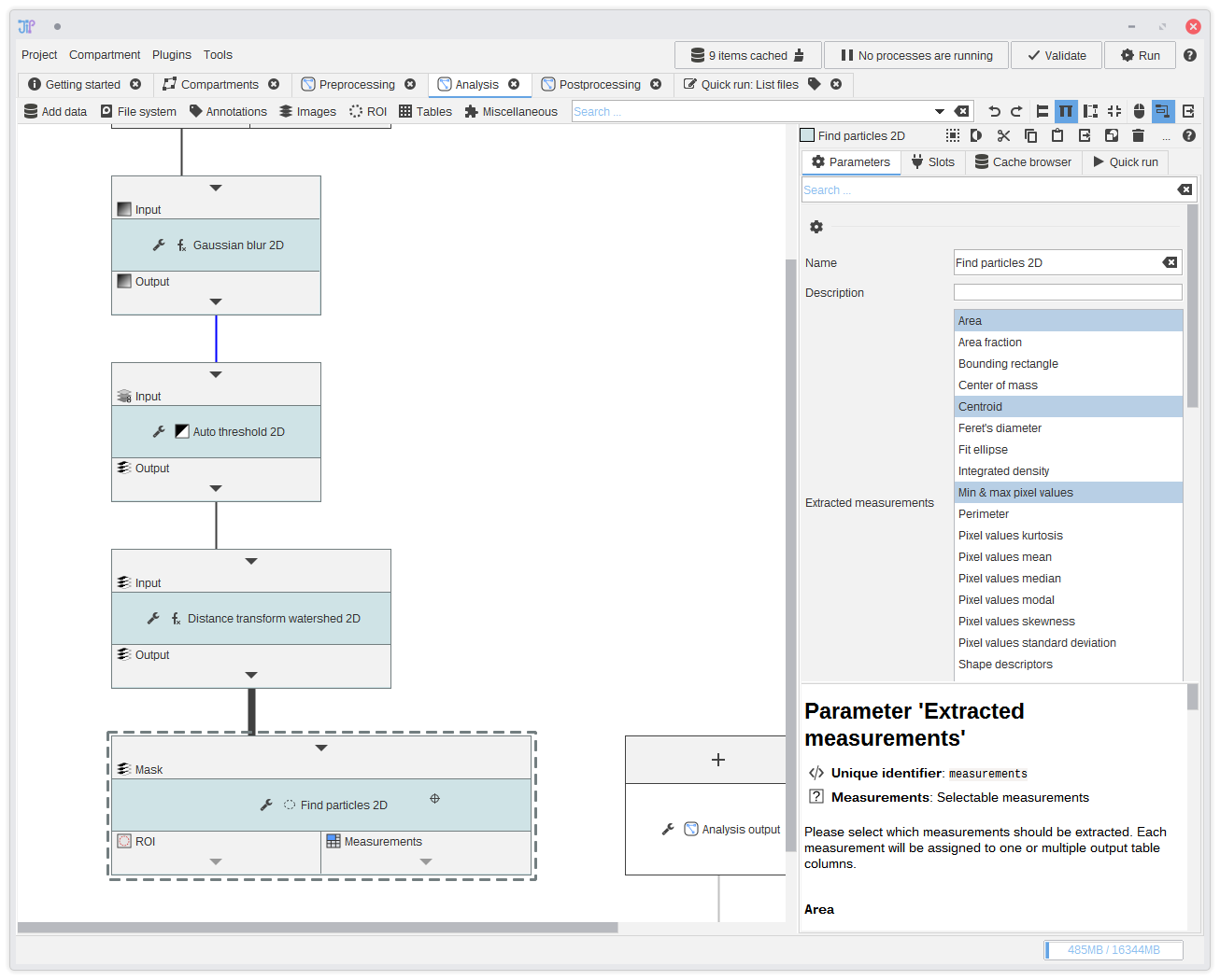
16. Finding the particles
Add following algorithms to the graph and connect them the the previous output:Images > Threshold > Auto Threshold 2DImages > Binary > Distance transform watershed 2DImages > Analyze > Find particles 2D
This will create a more or less accurate segmentation of the objects (spores) that are visible in the data. The generated masks are then analyzed to extract ROI and measurements.
17. Analysis output
Create multiple analysis output slots via the button. Export at least the measurements table. In our example, we exported the mask, ROI, and the measurements.You can hide edges if you want. Just click the or and select Hide edge.
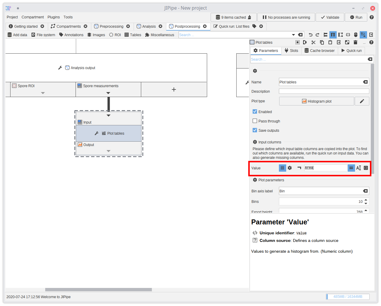
18. Postprocessing
The postprocessing consists of generating a histogram plot of the spore particle areas. You can find a node that generates plots inTables > Plot > Plot tables.
Connect the measurements to the plotting node and set its plot type to Histogram plot.
You see that the node parameters change. They adapt to the the currently selected plot and expect from you to input from which table column(s) to extract the data from. Either you know the name of the columns, or you can use the testbench to generate output and check it yourself. Some algorithms also write the names of their output columns in their description.
The correct column for the measurements is
Area.
You can also change various plot-specific settings and determine how output images are generated.
The plot node automatically generates SVG and PNG renders in the selected resolution. This is not a definite choice, as JIPipe has its own plot builder that can import generated plots from within the results UI.
Aside from exact matching, plot input columns can be matched via a regular expression or generated. Use the generator by selecting . A generator can be useful if you have no matching column within your data.
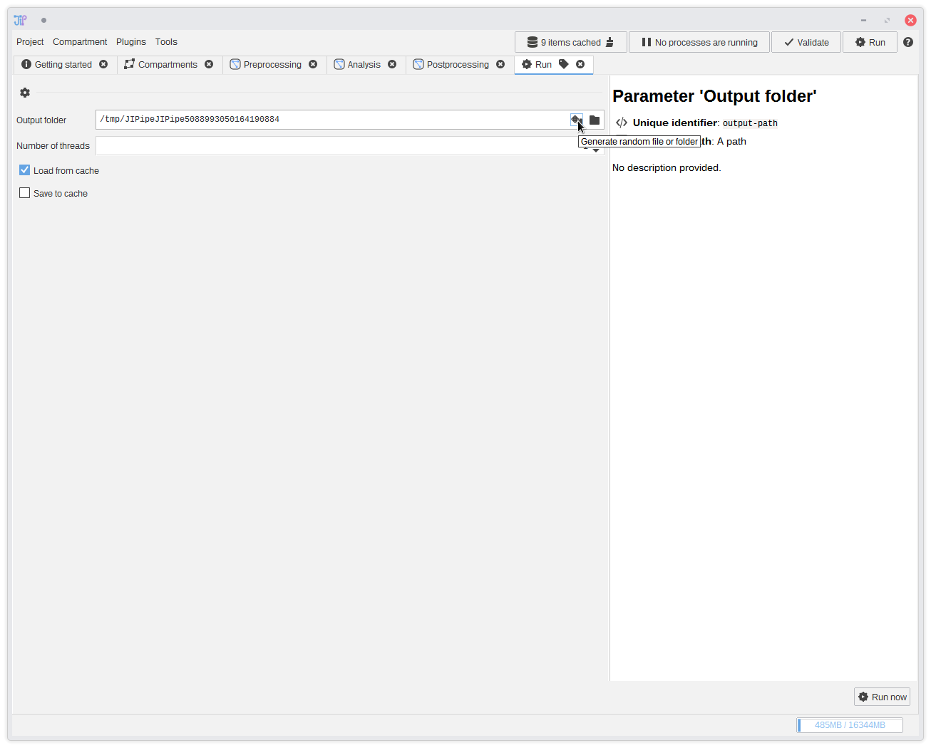
19. Running the pipeline
To run the pipeline, click the Run button at the top right corner. This will open a new tab where you can select the output directory. You can also generate a random folder that will be located on your operating system's temporary directory by clicking theAfter setting up the parameters, click Run now.
JIPipe attempts to prevent the most common errors (such as wrong parameters) and displays a message if something was found. Please follow the instructions of those messages. Depending on the data and algorithms, the behavior might not be forseeable and a crash occurs during the processing. A similar easy-to-understand message is shown on how to proceed or repair the issue.
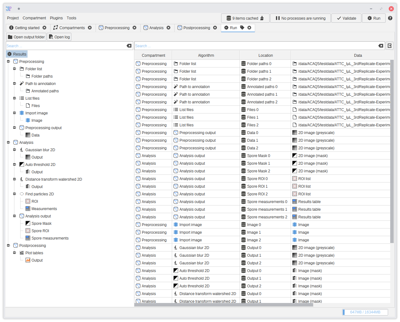
20. Displaying results
After the pipeline was successfully executed, a result analysis interface is shown. It displays the results of all output slots. You can navigate through the results via the tree on the left-hand side. On selecting a row, an interface is displayed below the table that contains various operations to import or open the data.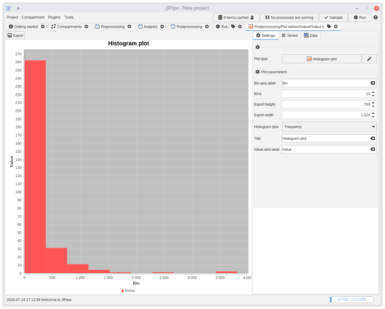
21. Displaying plots
To open the generated plots, navigate toResults > Postprocessing > Plot tables > Output and double-click an entry in the list.
Alternatively, you can also select the row and click Open in JIPipe. This will open a new tab with a plot builder tool.
Please take a look at the plots and tables documentation for more information how the tool works.